
Personal Branding: Building Your Brand Kit
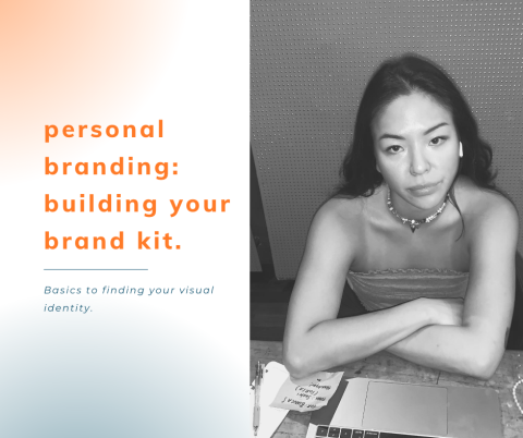
Post created by Bianca Slamet, Product Manager of AIMC Fall 2022
So, you plan on building your own personal brand?...
When you hear of Nike, what do you think of? Is it their famous swoosh logo? Is it the “just do it” slogan? You might even think about their iconic orange/red shoe box. All these different elements create a brand kit, also sometimes known as a brand book. As a creative in the Marketing field, developing these brand elements might be one of the most exciting parts of the job- especially when you’re building your own personal brand.
What is a brand kit? A brand kit is a term that refers to a brand’s visual identity- it’s how brands distinguish and differentiate themselves as well as to maintain brand consistency- consistency aids brand recall.
Okay, now on to the fun stuff:
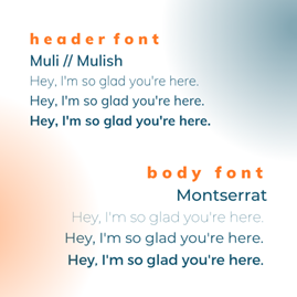
Typography: Typography is the art of fonts. While there are so many fun fonts to choose from, it is important to see if the fonts you are choosing are available across all software/programs you are using and are likely to use in the future (ie. WordPress, Elementor, Microsoft Office, Canva). Choosing fonts that are “artisanal” and uncommon can be a pain in the long-run, and not all software and programs allow you to upload fonts. Remember, the goal of a brand kit is to create consistency. You might want to consider different fonts to use for your logo, header, as well as body. I chose Muli, sometimes known as Mulish for my header font, and Montserrat for my body fonts (these fonts are commonly built-in in most software). However, I decided to choose a fun font “Barbra Semi Condensed” for my logo because you will be exporting your logo into either .PNG’s or JPEGS but I will discuss this further in the next section.
Logo: A logo is a combination of text, graphics, or images that is used to identify a brand and aid with public recognition. Since the name of my brand is simply my name, “Bianca Slamet”- I decided to create a simple logo with a lock-up of my tagline underneath. I had a few variations of my logo for different uses. The first is the one you see up top on the left side of my website, which I use a lot in my branding. The second one is a stretched-out logo where my last name is to the right instead of below my first name, which is used in my resume to prevent white space. And the last one is just my initials “BS”- which I used as the icon you see on the website tab. If you have variations of your logo used for different purposes, make sure that they have similar fonts, icons, and colors- remember that repetition is key.
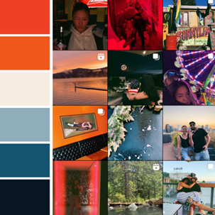
Color Palette: Finding my colors was my favorite part of creating my brand identity. As you can see on my website, the prevailing colors are orange (hex code: #F0581B) and dark aquamarine (hex code: #155470). These are complementary colors of the color wheel, and truly represent my fun and bold side. How I chose these colors? My Instagram feed has always been snapshots of my that best represented my life. So, I took a screenshot of my feed and using the color picker from our best friend Canva, I pulled colors that were prevalent and made sure that these colors are complementary and worked well together. While I had picked out six colors for my brand elements, I decided to go with just orange and dark aquamarine as my main colorway.
For those with a creative mind, building your brand kit will be your favorite part of creating your brand. Something about seeing your logos, fonts, and colors come to life really brings out your personality and gives that personalized feel to your projects.
Read more at biancaslamet.com