
Finding My Brand Elements
Last Fall for my integrated marketing communications course at WWU, I started developing my personal professional brand, complete with a creative strategy and a professional website. Read this blog to learn more about my process of finding my brand elements!
Post created by Glory Burford
Applied IMC (Winter 2023)
How I Created My Explainer Video
Last Fall for my integrated marketing communications course at Western Washington University, I started developing my personal professional brand, complete with a creative brief, brand elements, and this website! One of the very first things I worked on was my brand elements, as I was excited to find an aesthetic identity for my brand!
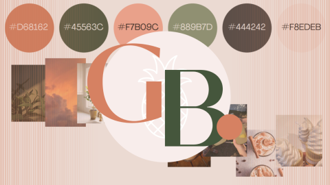
Brand Colors
![]()
Figuring out the colors that I wanted associated with my brand was tricky. Why? Because I like a lot of colors! But the idea wasn’t to make my brand colors my favorite colors, but to make them colors that fit with who I am and what feeling I want conveyed.
I began by asking my fellow classmates and friends what colors came to mind when they thought about me (making it clear I did not just mean what colors I wore often). The colors most commonly said were green, orange, and pink. I then used trusty Google to see what these colors symbolized to make sure they aligned with my values:
-
Green: New beginnings, freshness, growth, and balance
-
Orange: Youth, optimism, and enthusiasm
-
Pink: Love, compassion, and playfulness
Once I saw the symbolism associated with these colors, I knew I wanted to use them. Pink even symbolizes compassion, which is part of my brand tagline: Passion + Compassion.
I played around with the colors a bit to adjust them to my liking and have them complement each other better; I combined orange and pink into a more coral/salmon color and decreased saturation a bit to be easier on the eyes. The last two colors in my color palette are my body text color and a background color used on my website and logo.
Logo
![]()
![]()
To create my logo, I started by looking at the different templates on Canva to gain inspiration. I knew that I wanted include my tagline in my main logo and feature my initials in my icon logo.
After getting a feel for what kind of logo I liked, I used Canva to make necessary adjustments to colors, fonts (sans serif, always), and spacing so that my tagline could display correctly under my name. I also decided to add a little flair to my icon logo by putting a sneaky pineapple behind my initials: Have you spotted it?
However, creating brand elements is a gradual process, and creativity is never finished; I am hoping to design an updated logo in the near future, so stay tuned!
Fonts
![]()
Deciding on brand fonts was a process with many unexpected twists and turns. I created my creative strategy document on Canva, so the fonts I decided on were from Canva’s vast font library. My header font was a wide and bold version of my body font, for ease of readability.
However, once it came time to translate my creative strategy into this professional website, I quickly realized my error: WordPress has a much more limited font library than Canva, and the font I had chosen was obviously not included. Because of this, I had to select a WordPress font that was the closest match to the one I had on my creative strategy. I also realized that the font on my website was not available on Canva either! All this to say, learn from my mistake and remember to consider font availability on different platforms.
Tone and Brand Associations
![]()
My brand tone is friendly, warm, and laid-back. I decided on this tone by thinking about how I naturally carry myself and how I want my brand to be perceived. I have always highly valued warmth and welcoming in the people I meet, I feel that it makes it much easier to approach someone and feel comfortable in their presence. This is why I wanted my brand (and me, by extension) to feel approachable above all else.
In order to achieve this tone with my brand associations, I thought about what looks, scents, sounds, tastes, and tactile feelings elicited that warm emotional connection. I once again asked classmates and friends what they associated me with in each of the 5 senses. Once I got past all the joke responses (unfortunately my 5 sense associations cannot be just pineapple), I combined them with my own senses that I connect with feelings of warmth and comfort.
There are elements of nature I find vey comforting, such as soft grass and the sound of birds tweeting and light sprinkling. Warm blankets, worn flannel, and the smell and taste of cinnamon and vanilla remind me of waking up relaxed at home. With my brand associations put together, all that was left was to make mood boards, collages that represent an idea or feeling, for each of the 5 senses. This part was probably my favorite task to work on, as I got to incorporate everything that came before into the images I chose, keeping in mind my brand colors so that everything looked consistent.
You’ve reached the end of this blog post! I hope reading about my thought processes helps you to find your own cohesive, unique-to-you brand elements with fewer roadblocks; remember that whatever you decide on should be integrated across all your brand communications and platforms!