
State and Local Data
The Center draws from many different local and regional data sources to create standard and specialized analysis based reports. The tabs below provide access to the most commonly requested data sets that are periodically updated. These highlights the key data series and sources for information at the county, state and border crossing levels.
Specialized reports and analysis are available through our Business and Community Projects. Please call or e-mail for more information on how we may be able to help you.
The figure for this page is currently being revised
It is important to note that different data series are available for employment. The Current Employment Survey or CES series is one option which is particularly useful if you want to see longer term trends in employment by region and major industry sector. Figure 1 above provides an illustration of these data.
Data is available from Washington State Dept. of Employment Security. Simply choose the economic reports and data option and the employment estimates (CES) option to see the data.
Figure 1. Share of Total Employment by County and Sector
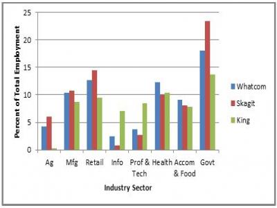
Figure 1 illustrates one way of using the QCEW (Quarterly Census of Employment and Wages) data provided by the Washington State Dept. of Employment Security. (The graphic was prepared by the Center for Economic and Business Research at WWU, using data from 2011. Annual figures for employment and wages for 2012 will be available in 2013,)
To access the data go to reports, data & tools and select the industry data, reports, and tools option. You will have the choice of downloading an Excel file that has employment and wage data for each county for different years and/or quarters. Please contact us with any questions or if you need help accessing the data.
This data source also provides estimates of wages, by county and industry sector. The following table shows some of the data available (with figures from 2011).
| Industry Sector | Whatcom | Skagit | King |
|---|---|---|---|
| Overall | $39,342 | $37,929 | $63,283 |
| Retail | $25,366 | $27,306 | $38,213 |
| Manufacturing | $56,229 | $57,530 | $78,286 |
| Professional & Technical Services | $56,947 | $47,762 | $86,899 |
| Government | $46,145 | $44,539 | $59,391 |
For more data on wages see the notes below Figure 1.
A few thoughts to keep in mind:
- Agriculture in this case = agriculture, forestry, and fishing
- Manufacturing includes food manufacturing, aluminum refining, oil refining, and many other jobs
- There are different estimates of employment; the QCEW figures rely on data for workers covered by unemployment insurance. Be sure to be consistent when comparing figures across place, sector, etc.
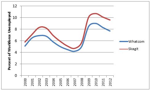
When thinking about unemployment figures, several items deserve attention. First, unemployment rates are ratios. They show the number of people actively looking for work divided by the labor force. If an unemployed worker becomes discouraged and stops looking for work (e.g., stops doing things that let the Dept. of Employment Security or Work Source know they are looking for work), they are not counted as unemployed. Moreover, the labor force does not include everyone. It does not include students, individuals in the military, or other particular individuals. So the ratio can change if people who have been out of work start looking again, if people move to the area or leave the area and change the labor force, etc. Second, it should be noted that the low unemployment rates we saw in 2000 and the mid-2000s coincided with the dot.com bubble and the housing/credit bubble. We may not want to look at those figures as normal.
Dispensing with the caveats and warnings data are available that show current rates of unemployment at the county level. Data are available either seasonally or not seasonally adjusted. In addition, historical figures are available back to 1990.
Figure 1 shows annual unemployment rates in Whatcom and Skagit Counties from 1990 through July 2010. (Figure last updated August 2012.)
Figure 1. Annual Unemployment Rates 1990 2012 (2012 figures are preliminary)
To access the underlying data, go to the report and select the Regional Reports, Data, and Tools option, then the local area unemployment statistics option. Figure 1 above shows historical estimates.
Please contact us at the Center for Economic and Business Research if you have any questions or need help accessing the data. (You can also find unemployment estimates at the U.S. Bureau of Labor Statistics website.)
The Washington State Dept. of Employment Security updates regularly labor market summaries for metro and other areas, as well as community profiles for workforce development areas. Go to reports and publications to see what is available. Be sure to click on "Regional reports, data and tools". And let us know if we can help when it comes to accessing or explaining the detailed information.
The Employment Security Dept. also provides data on size of firm which shows how many firms there are of different sizes, by county. The data also show how many workers are employed by firms of different sizes.
Figure 1 shows the distribution of firms, by size. The figure begins to highlight a striking pattern. The distribution of firms is quite similar, regardless of the county. (Perhaps this finding isn't very surprising when you think of how many businesses that employee 1-4 or 5-9 people exist for each business with, say, 1,000 workers.)
Figure 1 shows annual unemployment rates in Whatcom and Skagit Counties from 1990 through July 2010. (Figure last updated August 2012.)
Figure 1. Distribution of Firms, by Size (2011))
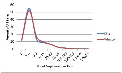
When you access this particular page of the Employment Security website, you need to click on the view all button under the industry data, reports, and tools option. The expanded list of choices will include the size of firm data.
Please contact us at the Center for Economic and Business Research if you have any questions or need help accessing the data. We will also update the figures here annually.
As mentioned, the size of firm data sheet also shows information on the distribution of workers. And it may be worth noting that while 12 percent of the firms in Whatcom and King Counties have no employees, and 52-56 percent of the firms have 1-4 employees, those firms do not employee a large portion of the workers. The following figure illustrates how more of the workers are employed by mid-sized firms and in the case of King County, a few very large firms. (Where Whatcom County has a few firms with more than 1,000 workers including Peace Health and WWU King County has more and, as a result, has a larger share of workers employed by those firms.)
AList of top 25 employers for Whatcom County is also available.
Figure 2. Distribution of Workers, by Firm Size
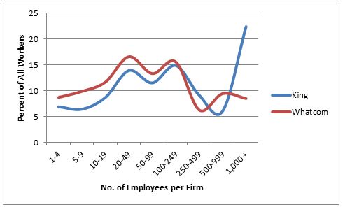
Note: we have not included Skagit County in these figures because certain data points for Skagit County have been suppressed due to confidentiality reasons. The State does not report data under certain circumstances, such as when there are very few firms in the category.
REAP is the Regional Economic Analysis Project both a portal to data from the U.S. Bureau of Economic Analysis and a tool that provides first level analysis (and graphics) of the data.
You can compare income, employment, population growth and more across regions. For example, by selecting the state of Washington and comparative trends analysis, you can easily generate a graphic like the following which compares per capita income, by year, in two counties in the state.
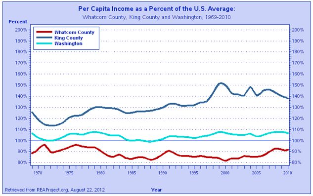
Figure 1. Southbound Border Crossings and Exchange Rate 1990-2012
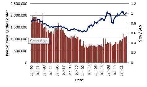
Figure 1 shows the number of people crossing the US/Canada border, by month, traveling southbound into Whatcom County. (Note: the data in the chart do not include crossings into Pt. Roberts, but those data are readily available.) The figure also shows the exchange rate between the Canadian and US dollars. These two data series were highly correlated in the 1990s, with the relationship between the two breaking down in 2001 due to increased border security, changes in the retail sector in lower mainland B.C., and other factors. Data sources include U.S. Customs and Immigration Services and the Bank of Canada. The figure was prepared by the Center for Economic and Business Research at WWU and is updated quarterly. (The figure was last updated in June 2011.) Please contact us at the Center for Economic and Business Research if you would like access to the data.
Figure 2. Southbound Border Crossings and Exchange Rate 2003-2012
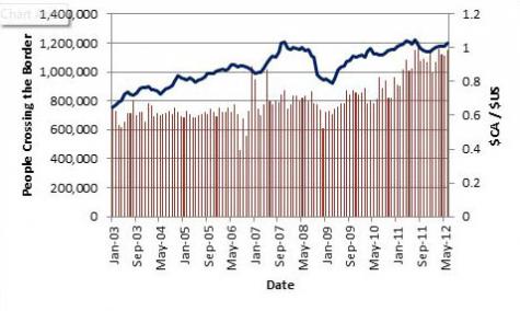
The following figure shows the same information, but for a more recent and shorter time period. This figure illustrates how southbound border crossings have increased with a strengthening Canadian dollar, perhaps suggesting a stronger relationship again between the exchange rate and border crossings.